I had an old ruler, a freebie from an advertising company. On its clear plastic length, it read
It’s the Eye that Buys
I can’t argue with that – even for books. But there’s more than immediate appeal,we also say that:
The Eyes are the Window to the Soul
Windows work both ways – what we see can speak directly to our inmost selves – and nowhere is that more important than through the eyes of children.
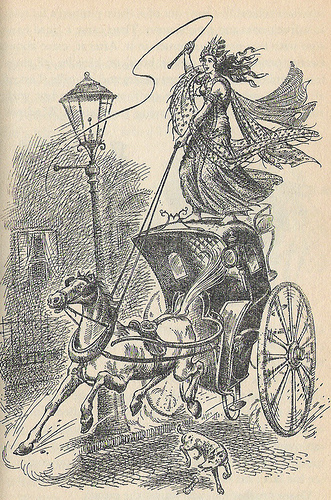
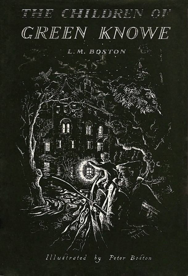
The books I read as a child are inseparable from their covers and illustrations. I cannot even think of Narnia without Pauline Baynes’ beautiful work, nor could The Phantom Tollbooth exist unless Jules Feiffer had drawn it. There are so many – Winnie-the-Pooh has to have E. H. Shepard’s delicate pencil work and the Green Knowe books weave their magic through Peter Boston’s artwork.
For our youngest, most precious readers, picture books are essential and formative. The banter between the picture and the words can be hilarious, or heart-warming, or comforting. In the best examples, the relationship of image to text gives a creative depth where a child can learn for themselves. This is one reason why I would plead for more illustration in MG, teen and YA books – and I’m solely a writer.
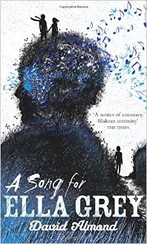
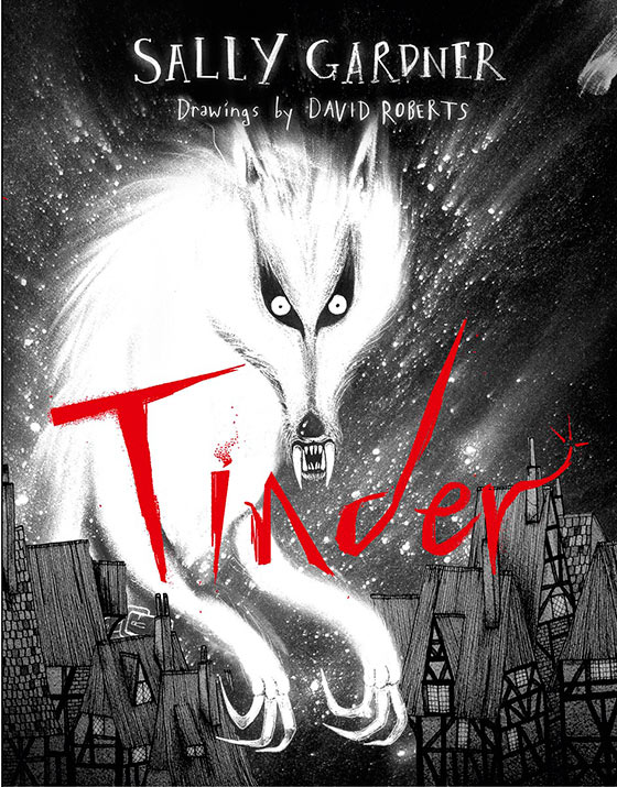
I am also a book reviewer (for Serendipity Reviews and Fantasy Book Review). In that context the cover, in particular, is crucial. It must:
- appeal to the readers who will enjoy the story
- not deter readers who aren’t the usual suspects
- convey the genre accurately
- suggest the mood – comic, romantic, eerie
- give a hint of the writing style – easy to read, poetic, bold and dramatic…
- give clues to the emotional aspects of the book
- not look too old, or particularly, too young for its readership
Tall order, isn’t it? That’s why stock photography* just won’t do. It shuts down the readers’ imaginations. It funnels their expectations into a very narrow channel. I particularly loathe headshots of pretty thin white girls – especially in historical fiction (the costuming is always wrong). It excludes all other possibilities. And don’t get me started on white-washing, or pink.
Whereas creative artwork (*which can include photography) leaves space for the reader. It talks (or giggles) with them, rather than shouting at them in the manner of Cillit Bang!
It is entirely natural for humans to be very visual, and it is entirely reasonable for marketing departments to appeal to that. However, I’m making a plea for stepping away from the cheap, the lowest common denominator, the ‘we’d-better-do-that-cos-they-did’ in book design. Let the very first impression of any book for young people be one of quality.
They deserve nothing less – and they will be drawn to it.
Part Two next week: The Naming of Cats


Totally agree! Never, ever will I or you hear the phrase ‘That will have to do’, in my studio or from your keyboard. Do the best you can do and then some.
Thanks Mik! I hope you’ll read part II next week too.
You’re absolutely right. As they say, ‘A picture is worth a thousand words’. I despair at some of the generic book covers that look as if they’ve been given five minutes thought, if that. I adore the artwork in Barefoot Books’ picture books. They are works of art on their own. And, although I think Kindles are amazing for reducing paper consumption, it is so much flatter than the whole book in your hand experience – and not just even the pictures, remember the beautiful orange edges on Jon Mayhew’s Mortlock?
Hello Bekki – thanks for making the effort to reply at length. You make a great point about whole book design – it really is important to the reader’s experience. Cheap approaches tell children books don’t really matter.
I completely agree! Words and pictures are indelibly intertwined and I still can’t look at illustrations from my childhood books without feeling the same sense of wonder that I felt then. Bland stock imagery is not a short cut to reader engagement, but it’s a sad result of limited publishing budgets. Not all books will have decent budgets behind them to justify commissioned illustration, but a little more effort in bringing the books to life through decent design – colour, typography, layout – comes a close second. It just takes a little creative thinking and the belief that pictures matter.
Hello Helen – and thank you for commenting. I see what you’re saying about budgets – but I think it’s false economy. Definitely “pictures matter”!
I like your analysis list. I hadn’t really thought about it before-especially links between design and writer’s style.
Thank you Michael for your encouraging words – and for making the time to reply.
Baynes and Lewis are Narnia and you can’t have one without the other. A world of ‘Snap!’ I’ve been saying this non-stop since Monday and the launch of #picturesmeanbusiness. Loud applause for this post.
Thanks, Karen – good to hear from you on here.
Pingback: The Naming of Cats | K.M.Lockwood
YES!
Pingback: Ten-Minute Blog Break – 17th February | Words & Pictures